Why Does Russia Look So Big on Maps?
Why Does Russia Look So Big on Maps?
Have you ever looked at a world map and wondered how Russia could be so enormous? On many maps, especially the ones we see online like Google Maps, Russia appears as a colossal landmass, seeming to dwarf continents like Africa. But here's a spoiler: it's a trick of the light, or more accurately, a trick of the map.
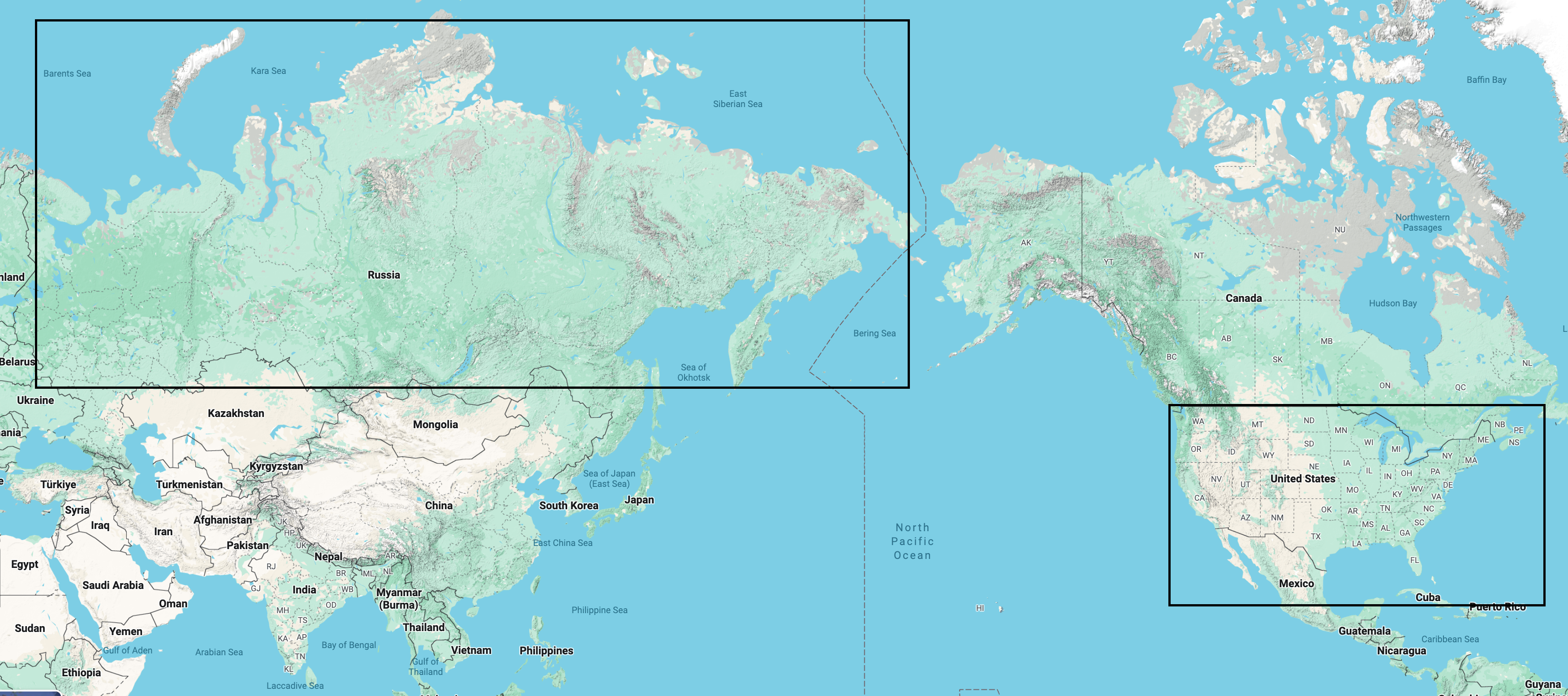
This common visual distortion isn't a mistake; it's a side effect of a centuries-old challenge: how do you represent a round, 3D planet on a flat, 2D screen?
The Culprit: The Mercator Projection
The map you're likely looking at uses the Mercator projection. Created by cartographer Gerardus Mercator in 1569, its original purpose was brilliant—for navigation. On a Mercator map, any straight line is a line of constant true bearing, allowing sailors to plot a course and follow it without constantly adjusting their compass.
To achieve this, the projection uses an ingenious method. Imagine the Earth as a translucent globe with a light bulb at its very center. Now, wrap a cylinder of paper around the equator of this globe. When the light shines from the center, the continents and countries are "projected" onto the cylinder.
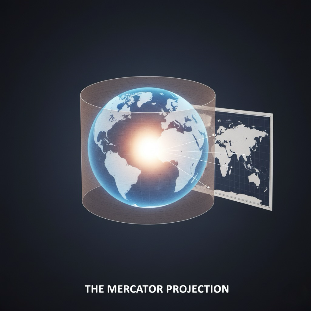
Then, the cylinder is unrolled and flattened into a rectangular map.
This "stretching" effect is minimal near the equator but becomes increasingly pronounced as you move towards the poles. This is why countries near the equator (like Ecuador or the Democratic Republic of Congo) are shown at roughly their correct size, while countries near the poles (like Greenland, Canada, and Russia) are stretched out dramatically. This is why Greenland looks as big as Africa, when in reality, Africa is 14 times larger. And it's why Russia, with its vast northern territory, looks disproportionately massive.
Seeing the True Size: Our Approach
So, how can we get an accurate sense of a country's size? The best way is to see how it looks without the distortion of high latitudes.
This is exactly what our Region Map Comparison tool does. We built it on a simple but powerful principle: to compare the true size of two different places, we digitally "move" them both to the equator. By placing them side-by-side in this zone of minimal distortion, their real shapes and relative sizes become immediately clear.
You can see within our tool that when Russia is moved to the equator, by comparing it to the United States, it appears it's not as overwhelmingly large as it seemed on the Google maps as the image we showed earlier.
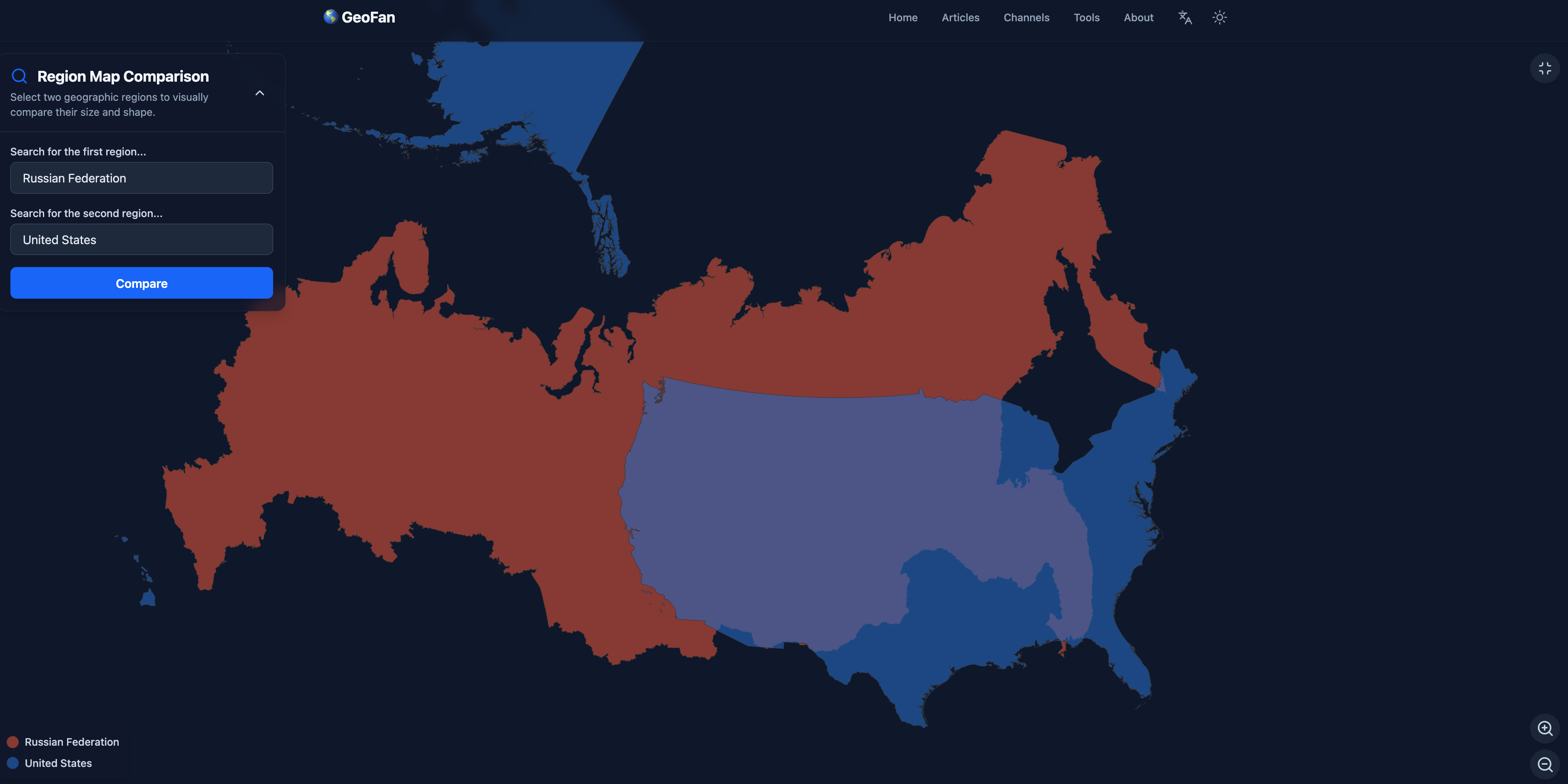
This approach is similar to what you might have seen on websites like thetruesizeof.com. By dragging a country to a different latitude, you can see how the Mercator projection shrinks or expands it.
However, our tool offers even more flexibility. You're not just limited to comparing countries. Ever wondered how the state of California compares in size to the entire United Kingdom? Or how Japan stacks up against the state of Montana? With our tool, you can compare countries, states, provinces, and other regions to gain a more accurate and surprising perspective on the world.
Don't let a map designed for 16th-century sailors shape your understanding of the planet. Give our tool a try and see the world as it truly is.